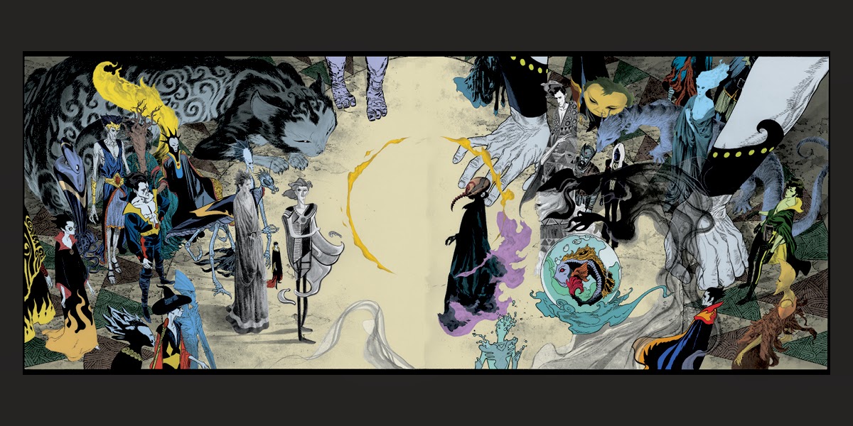
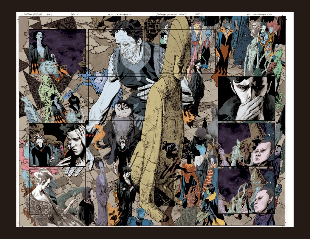
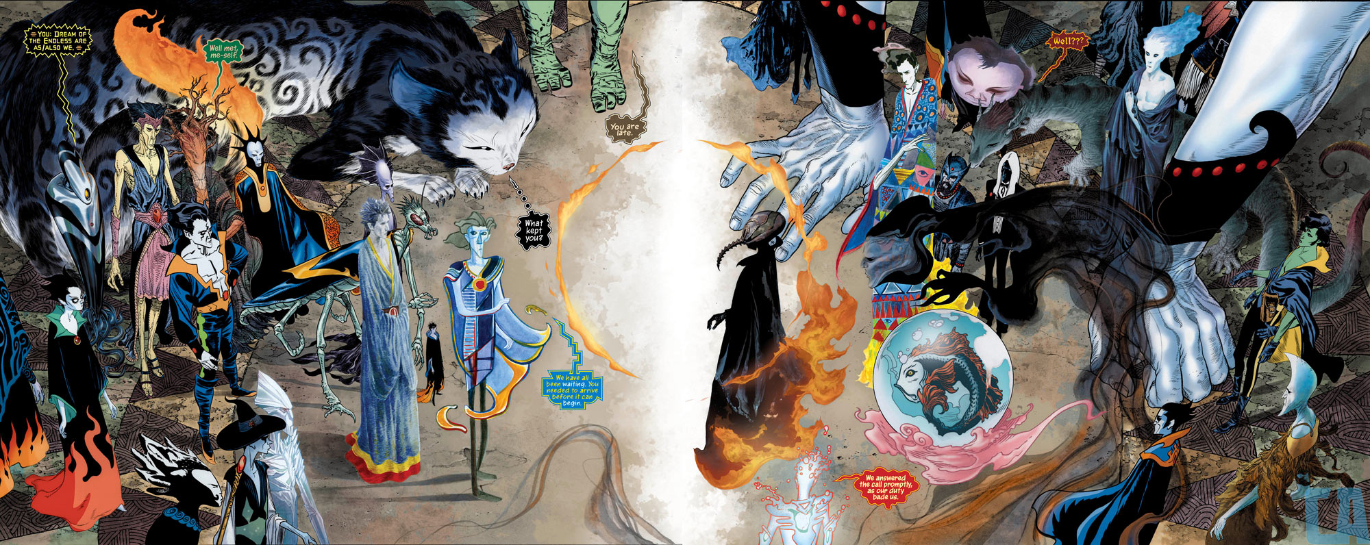
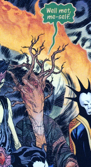
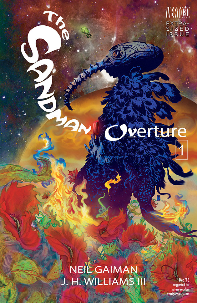
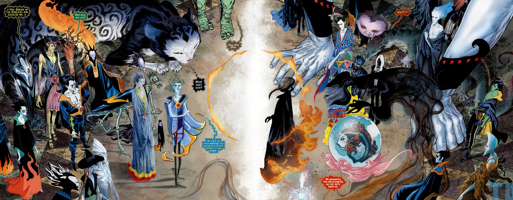
As much as we would like there to be information regarding these varying Sandmen from across the cosmos, the artist who paints them says they are not meant to be illustrative of anything or anyone in a conscious fashion. He painted each with no particular reference, only varying the palette of techniques used to render them. If they resemble something from the existing DC Universe, it is completely coincidental.

In a 2013 Comics Alliance interview with the artist J.H. Williams we learn:
CA: That manifests in a major way in this issue with the big four-page spread of all the Sandmen from across the universe. Some are illustrated in different styles while some — and maybe this is just an illusion? — seem to be illustrated in different mediums and tools altogether.
JHW3: I definitely wanted to make it feel that each of these Sandmen steps out from their own other world or dimension. It was important to sell the idea of their uniqueness by changing their art styles because we’re not going to get much exposure to them. The way something is drawn immediately impacts the way a reader feels about it.
JHW3: I took that approach to each of these characters. It gives the reader an immediate impression of what that character is like but in a very abstract way, which is kind of cool. As far as the different mediums, some of that is definitely true. There’s some stuff that’s hand-painted, some stuff done in washes, some stuff that’s only pencil that’s been colored [by Dave Stewart].

Sandman Overture (four-page spread): Williams designed each Sandman on-the-fly as he drew the page, employing different styles and illustration techniques such as paint, ink wash and pencil as needed. Color by Dave Stewart.
CA: You must have lots of Sandmen design sketches lying around the house.
JHW3: There aren’t any. All those decisions, I made them at the time, doing the artwork on the spread. Whenever I do that kind of thing where I approach a character with a certain style in mind, the decision is often made on the fly; what my gut tells me is right with that particular character. That’s pretty much how I treated this spread. I knew there were certain styles I wanted to try to bring into play, but where they were going to apply wasn’t overly thought out. I just kind of… did it.
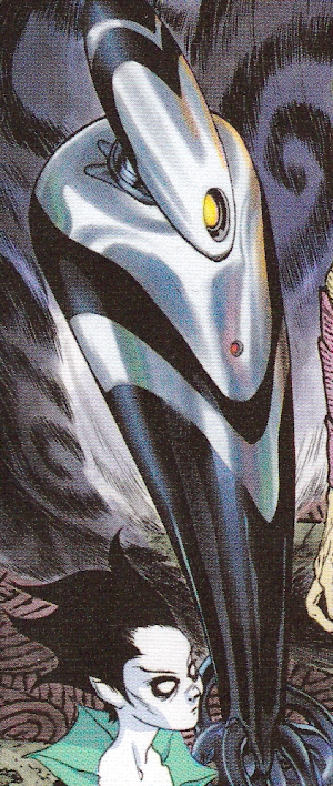
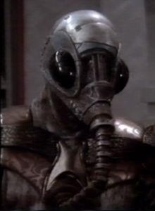
CA: That’s very surprising. Who are your favorites on the page? I want to hear more about a lot of them. Like the Robot Sandman!
JHW3: I like the robot one! Neil had a couple suggestions in the script of possible Sandmen. A couple of those didn’t get to appear in this spread but they’ll get to appear when we return to the scene. The robot one was intriguing because when people think of different versions of Morpheus, the lord of dreams, people always think in organic terms. What’s Morpheus like for machine life?
CA: Do Androids Dream of Electric Sheep?
JHW3: Exactly! I thought that was interesting. So I really like that one.
CA: Who else is a favorite?
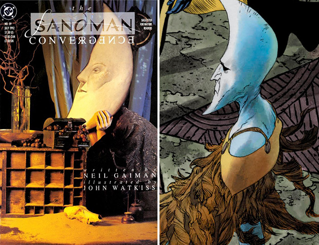
JHW3: I love the giant cat, I thought that was a lot of fun. The two others that stand out to me are the green-skinned Sandman with the four arms — the way he’s dressed reminds me of an old pulpy space adventure hero — and the character next to him, who looks like he has a crescent shaped head. He reminds me of something you might find in an illustrative fantasy book of some kind.

The Sandman Overture JH Williams Crescent Moon Guy Dave McKean - A subconscious homage to longtime ‘Sandman’ cover artist Dave McKean appears in Williams’ super Sandman splash.
CA: The crescent moon guy also reminds me of a Sandman cover by Dave McKean [it was 1992's issue #39]. I seem to remember a guy with a crescent head sitting with his head resting in his hands Do you remember that one?
JHW3: Yes, I do!
CA: Is this that guy!?
JHW3: Who knows, it could be! It’s one of those subconscious things. The imagery from the original series is so powerful and strong, different things can live inside the back of your mind and you never realize something is coming out. Like that character reminding you of that particular cover — he reminded me of it, too. Once I saw that character as I was drawing him I thought, “Oh, this reminds me of that same cover!” which I thought was kind of funny. It’s cool.
CA: And the painted Sandmen?
JHW3: Of course I really liked toying with the painted ones, too. I think the Picasso Sandman is really fascinating. That came out really, really interesting to me. One of the things that occurred to me was, if we’re going to be showing what Morpheus is like on all these different worlds, and their views of him, that could be taken to the furthest extreme in terms of how they look, stylistically. Like going towards painted stuff such as abstract things or modern art perspectives like Picasso — what would that look like on the page?
REF: Artist JH Williams III Talks 'Sandman: Overture' [Interview]
