8

What does the small stamp/picture (usually in the upper left hand corner) on comic book covers indicate?

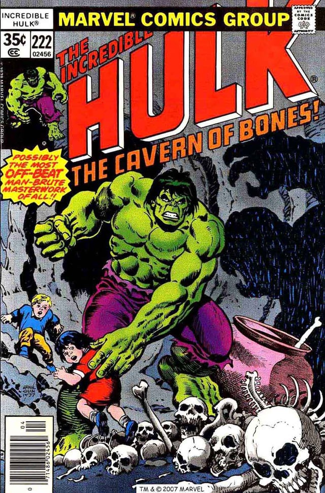
The Hulk below is the best example of what I am referring to (where he appears just below the "35¢" stamp). I was wondering if it was related to who was in the issue, or maybe a preview of who would be in the next issue.

A Hulk cover

4
  • Are you talking about the words or the drawing underneath it? If you're talking about the words, then the answers below should be what you need. If you're asking about the little drawing of the Hulk, you should specify that in your question. (maybe that's to make sure know it's a Hulk comic book)
    – RedCaio
    Commented Jan 25, 2016 at 8:46
  • I've made a changed to improve the clarity of this question, OP could you please advise if this is correct, otherwise, feel free to rollback.
    – Möoz
    Commented Jun 1, 2017 at 0:59
  • Do you mean "222?" I honestly don't, just clearing confusion.
    – Jay Goot
    Commented Nov 20, 2019 at 20:43
  • No, OP is referring to the small picture of the Hulk underneath the "222". The "222" is the issue number.
    – F1Krazy
    Commented Nov 20, 2019 at 20:49

5 Answers 5

6

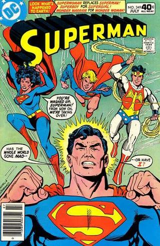
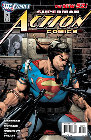
Without knowing exactly what you are referring to. Usually the corner denotes the publisher, character (or series), issue number, and price.

It may also contain the "Approved by Comics Code" stamp, and a bar scan.


Click for full resolution

This is pretty consistent between old and new comics alike.


Click for full resolution

5

The stamp indicates a brand or a category that the comics belongs to.

This is so that a reader who has picked up one comic she likes, will be steered toward similar titles from the same publisher. There can be more than one brand, sometimes taken to extremes. Note for instance the following Lucifer cover:
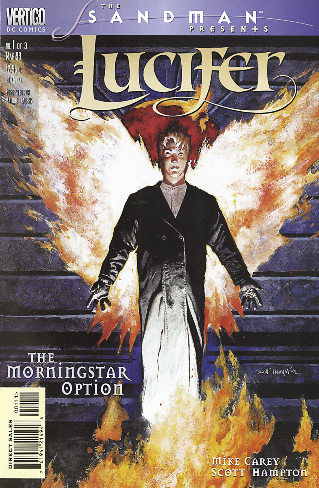
enter image description here

The cover classifies the comic in the following way:

  1. It's the march 1999 issue.
  2. It's part of a 3-issue miniseries named "the morningstar option"
  3. The miniseries belongs to The Lucifer title.
  4. Lucifer is a subset of the Sandman continuity, as shown by a "the sandman presents" heading
  5. Sandman and Lucifer is published under the Vertigo label, an "imprint" used to distinguish comics for a mature audience
  6. Vertigo is printed by the publisher DC Comics, which is named in a subheading under the Vertigo label.

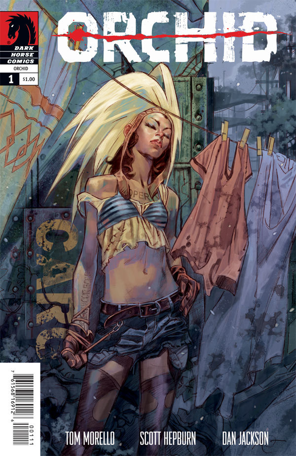
That's a classification hierarchy that's six levels deep! No doubt due to DC being a big publisher. (DC is owned by Warner Brothers, but they rarely add the WB logo to comics) It's then refreshing to see a smaller publisher's cover, like the Orchid issue below.
enter image description here

Issue 1 of "Orchid", published by Dark Horse. Just 3 levels.

3

Usually it's there to hold the issue number, issue month/date and cover price. Sometimes there is an image associated with the title as well (say, a small image of the title character), or just the publisher logo (DC does this a lot). Sometimes only the issue number is there, sometimes even the box itself isn't there and things are just grouped in that corner!

2

Historically, comics were often displayed in stores on a spinner rack, or on magazine shelves, where only the top third or so of the cover was visible.

Therefore, companies wanted to be sure that their comics could be easily picked out from just the top third of the book. So, that's where the logo was, and company identification, and (especially for Marvel) a small image of the lead character(s), so kids could find the comic they were looking for more easily.

0

It's a practice mostly done by Marvel. The small picture in the upper-left corner is used to show the main character(s) of the title for people unfamiliar with the comic. For superhero team comics, it usually (but not always) showed the team roster.

Your Answer

By clicking “Post Your Answer”, you agree to our terms of service and acknowledge you have read our privacy policy.

Not the answer you're looking for? Browse other questions tagged or ask your own question.