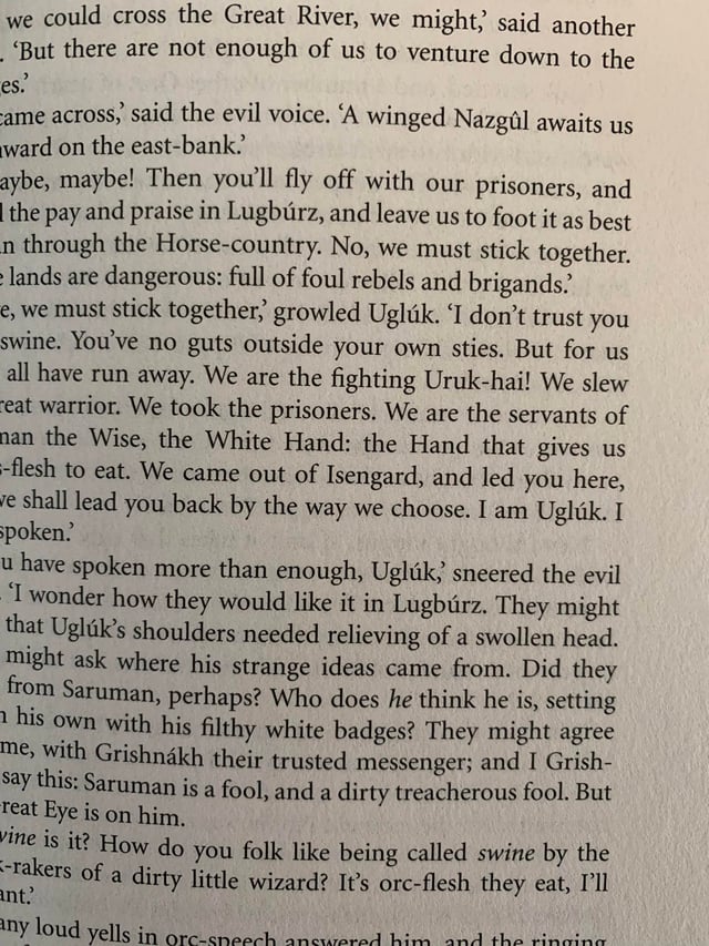
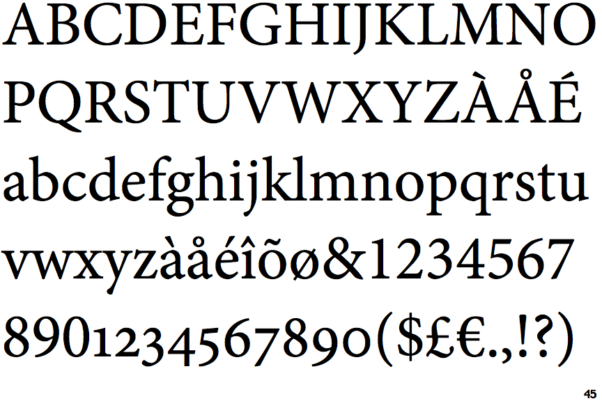
I've finally started reading The Lord of the Rings, and noticed that the new 2020 paperbacks (the Mariner edition from publisher HMH) use a different font than the 2001 book I owned. I really like the new font. Does anyone know what it's called?
-
4I’m voting to close this question because I don't think font identification for a regular book is on topic– OrangeDogCommented Oct 5, 2021 at 22:27
-
2No matter how I squint and tilt my head, I just can't see this question as on-topic for this site. Does anyone know of a StackExchange site where this sort of question would be on-topic? I know that fonts, and in particular, font identification, are a favorite hobby for some people...– MarthaCommented Oct 5, 2021 at 23:41
-
6@Martha Why would it not be on-topic? True, fonts aren't on-topic per se, but neither is underwear or the meaning of English phrases, but questions about underwear or meaning in the context of a work of sci-fi or fantasy are on-topic.– Rand al'Thor ♦Commented Oct 6, 2021 at 9:03
-
1@Martha it might be on topic at literature, certainly "Specific questions about the publishing process" are, and I've seen one recently about the printing process (I thought two, the other turned out to be a crafts, where I was torn between answering and calling it off-topic)– Chris HCommented Oct 6, 2021 at 12:28
-
4It's getting more and more common for font names being listed by the publisher in the colophon (the page, either in the front matter of the book or in the end matter, also listing the dates of the different editions, original title, copyright, ...). Have you tried watching there?– lfuriniCommented Oct 6, 2021 at 16:37
1 Answer
I think it's a font called Minion.
http://www.identifont.com/find?font=minion
I took the sample picture you provided and went through the "Fonts by Appearance" Q & A, though I had to skip quite a few, and eventually I ended up with a list of possibilities. This one seems to fit perfectly with the same text you provided.
If you can find additional capital letters, numbers, and symbols, you can narrow it down more accurately, but when I compare the letters in your sample with the shape of the letters in Minion, it seems to me a perfect fit.
-
3Seems that apostrophe in that font is different: fonts.adobe.com/fonts/minion (although there could be several ones) Commented Oct 6, 2021 at 10:32
-
@YaroslavKornachevskyi yah, you're right. It's weird though, because every other character is spot-on.– user145368Commented Oct 6, 2021 at 13:39
-
@YaroslavKornachevskyi It's true. Oddly, the grave mark over the
aabove looks like the acute mark over theuin Lugburz in the text, only reversed. I tried out the font on Adobe`s site Minion and blew it up to 120 pt size, and it looks like the acute and grave marks both have a slight upward slope on top, which causes them to look different from each other, not merely reversed. This may be a stylistic decision by the publisher or a peculiarity of the way the typesetting was done. Commented Oct 6, 2021 at 14:18 -
2@Kyralessa just checked for á and à - these two are present in Minion. And there also kind of custom apostrophe: ’ <- it could be the one used in the book. So +1 from me. Commented Oct 6, 2021 at 14:37


